Materai Design实践
Toolbar
themes.xml中的设置
<style name="Theme.MaterialTest" parent="Theme.AppCompat.Light.NoActionBar">
    <!-- Primary brand color. -->
    <item name="colorPrimary">@color/purple_500</item>
    <item name="colorPrimaryVariant">@color/purple_700</item>
    <item name="colorOnPrimary">@color/white</item>
    <!-- Secondary brand color. -->
    <item name="colorSecondary">@color/teal_200</item>
    <item name="colorSecondaryVariant">@color/teal_700</item>
    <item name="colorOnSecondary">@color/black</item>
    <!-- Status bar color. -->
    <item name="android:statusBarColor" tools:targetApi="l">?attr/colorPrimaryVariant</item>
    <!-- Customize your theme here. -->
</style>

除此之外还可一通过textColorPrimary\windowBackground和navigationBarColor等属性控制其他位置的颜色
用ToolBar代替ActionBar中的代码
更改activity_main.xml中的代码
<?xml version="1.0" encoding="utf-8"?>
<FrameLayout xmlns:android="http://schemas.android.com/apk/res/android"
    xmlns:app="http://schemas.android.com/apk/res-auto"
    android:layout_width="match_parent"
    android:layout_height="match_parent">

    <Toolbar
        android:id="@+id/toolbar"
        android:layout_width="match_parent"
        android:layout_height="?attr/actionBarSize"
        android:background="?attr/colorPrimary"
        android:theme="@style/ThemeOverlay.AppCompat.Dark.ActionBar"
        android:popupTheme="@style/ThemeOverlay.AppCompat.Light"/>

</FrameLayout>
- 用xmlns.app指定了一个新的命名空间
- 用app.:popupTheme属性将弹出的菜单指定成单色主题
更改MainActivity中的代码
public class MainActivity extends AppCompatActivity {

    @Override
    protected void onCreate(Bundle savedInstanceState) {
        super.onCreate(savedInstanceState);
        setContentView(R.layout.activity_main);
        androidx.appcompat.widget.Toolbar toolbar= findViewById(R.id.toolbar);
        setSupportActionBar(toolbar);
    }
}
在menu文件夹下新建toolbar.xml文件
<menu xmlns:android="http://schemas.android.com/apk/res/android"
    xmlns:app="http://schemas.android.com/apk/res-auto">
    <item
        android:id="@+id/backup"
        android:icon="@drawable/button"
        android:title="Backup"
        app:showAsAction="always"/>
    <item
        android:id="@+id/delete"
        android:icon="@drawable/button"
        android:title="Delete"
        app:showAsAction="ifRoom"/>

    <item
        android:id="@+id/settings"
        android:icon="@drawable/button"
        android:title="Settings"
        app:showAsAction="never"/>

</menu>
showAsAction:
- always永远显示在toolbar中
- ifRoom表示屏幕空间足够时在Toolbar中显示,不够就显示在菜单中
- never表示永远显示在菜单中
在onOptionsItemSelected()方法中处理各个按钮的点击事件
public boolean onOptionsItemSelected(@NonNull MenuItem item) {
    switch (item.getItemId()) {
        case R.id.backup:
            Toast.makeText(this, "You click Backup", Toast.LENGTH_SHORT).show();
            break;
        case R.id.delete:
            Toast.makeText(this, "You click Delete", Toast.LENGTH_SHORT).show();
            break;
        case R.id.settings:
            Toast.makeText(this, "You click Settings", Toast.LENGTH_SHORT).show();
            break;
        case android.R.id.home:
            mDrawerLayout.openDrawer(GravityCompat.START);
            break;
        default:
    }
    return true;
}
DrawerLayout
在布局文件中使用DrawerLayout
第一个子控件是主界面,第二个是滑动菜单
在第二个子控件中设置layout_gravity以指定滑动方向
在Toolbar最左边加入导航按钮,点击按钮显示滑动菜单
mDrawerLayout = findViewById(R.id.drawer_layout);
ActionBar actionBar = getSupportActionBar();
if (actionBar != null) {
    actionBar.setDisplayHomeAsUpEnabled(true);//显示按钮
    actionBar.setHomeAsUpIndicator(R.drawable.menu);//设置图标
}
并在前文说到的onOptionsItemSelected()方法中加入
case android.R.id.home:
    mDrawerLayout.openDrawer(GravityCompat.START);
    break;
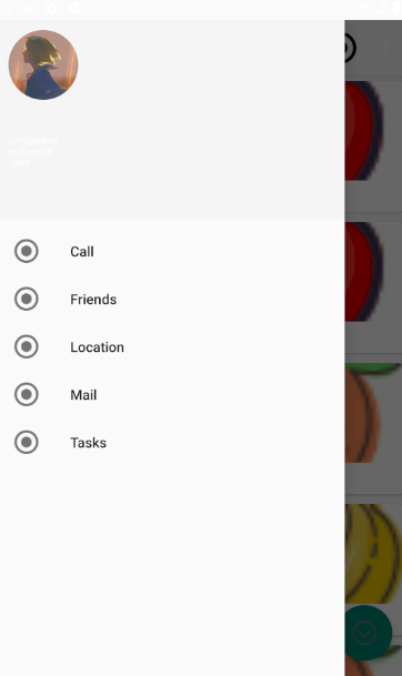
NavigationView
在dependencies中加入
implementation 'de.hdodenhof:circleimageview:3.1.0'创建一个nav_menu.xml文件来设置菜单项
<menu xmlns:android="http://schemas.android.com/apk/res/android">
    <group android:checkableBehavior="single">
        <item
            android:id="@+id/nav_call"
            android:icon="@drawable/button"
            android:title="Call"/>
        <item
            android:id="@+id/nav_friends"
            android:icon="@drawable/button"
            android:title="Friends"/>
        <item
            android:id="@+id/nav_location"
            android:icon="@drawable/button"
            android:title="Location"/>
        <item
            android:id="@+id/nav_mail"
            android:icon="@drawable/button"
            android:title="Mail"/>
        <item
            android:id="@+id/nav_task"
            android:icon="@drawable/button"
            android:title="Tasks"/>
    </group>
</menu>
整个headerLayout放头像,用户名
创建nav_header.xml
<RelativeLayout xmlns:android="http://schemas.android.com/apk/res/android"
    android:layout_width="match_parent"
    android:layout_height="200dp"
    android:padding="10dp"
    android:background="?attr/colorPrimary">

    <de.hdodenhof.circleimageview.CircleImageView
        android:id="@+id/icon_image"
        android:layout_width="70dp"
        android:layout_height="70dp"
        android:src="@drawable/head" />

    <TextView
        android:id="@+id/username"
        android:layout_width="70dp"
        android:layout_height="70dp"
        android:layout_below="@+id/icon_image"
        android:layout_alignParentBottom="true"
        android:layout_marginTop="33dp"
        android:layout_marginBottom="7dp"
        android:text="tonygreendev@email.com"
        android:textColor="#FFF"
        android:textSize="10sp" />

    <TextView
        android:id="@+id/mail"
        android:layout_width="wrap_content"
        android:layout_height="wrap_content"
        android:layout_above="@id/username"
        android:text="Tony Green"
        android:textColor="#FFF"
        android:layout_below="@+id/username"
        android:textSize="14sp"/>

</RelativeLayout>
其中CircleImageView用于将图片圆形化,用法与ImageView一样
将NavigationView放到DrawerLayout里作为滑动菜单(第二个子控件)
<com.google.android.material.navigation.NavigationView
    android:id="@+id/nav_view"
    android:layout_width="match_parent"
    android:layout_height="match_parent"
    android:layout_gravity="start"
    app:headerLayout="@layout/nav_header"
    app:menu="@menu/nav_menu" />
显示效果:
FloatingActionButton
- 在布局中添加FloatingActionButton
<com.google.android.material.floatingactionbutton.FloatingActionButton
            android:id="@+id/fab"
            android:layout_width="wrap_content"
            android:layout_height="wrap_content"
            android:layout_gravity="bottom|end"
            android:layout_margin="16dp"
            android:elevation="8dp"
            android:src="@drawable/down" />
其中layout_gravity控制控件的位置
elevation可调整其高度,控制投影效果
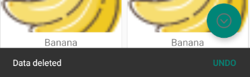
设置点击事件
FloatingActionButton fab = findViewById(R.id.fab);
fab.setOnClickListener(new View.OnClickListener() {
    @Override
    public void onClick(View view) {
        Snackbar.make(view, "Data deleted", Snackbar.LENGTH_SHORT)
                .setAction("Undo", new View.OnClickListener() {
                    @Override
                    public void onClick(View view) {
                        Toast.makeText(MainActivity.this, "Data restored", Toast.LENGTH_SHORT).show();
                    }
                }).show();
    }
});
这点和button相似
显示效果
Snackbar
Snacker跟Toast的用法相似
Snackbar.make(view, "Data deleted", Snackbar.LENGTH_SHORT)
        .setAction("Undo", new View.OnClickListener() {
            @Override
            public void onClick(View view) {
                Toast.makeText(MainActivity.this, "Data restored", Toast.LENGTH_SHORT).show();
            }
        }).show();
调用Snacker的make方法创建Snacker对象,make()方法的第一个参数传入一个view,当前布局的任意一个即可Snacker会自动查找最外层布局。第二个是显示内容,第三个是显示时长。
调用setAction()方法来设置一个动作,第一个参数为显示内容,第二个为事件
显示效果:
CoordinatorLayout
用法跟FrameLayout一样
使用后会将Snackerbar的动态效果优化
CardView
<androidx.cardview.widget.CardView xmlns:android="http://schemas.android.com/apk/res/android"
    android:layout_width="match_parent"
    android:layout_height="wrap_content"
    xmlns:app="http://schemas.android.com/apk/res-auto"
    android:layout_margin="5dp"
    app:cardCornerRadius="4dp">

    <LinearLayout
        android:layout_width="match_parent"
        android:layout_height="wrap_content"
        android:orientation="vertical">

        <ImageView
            android:id="@+id/fruit_image"
            android:layout_width="match_parent"
            android:layout_height="100dp"
            android:scaleType="centerCrop"/>

        <TextView
            android:id="@+id/fruit_name"
            android:layout_width="wrap_content"
            android:layout_height="wrap_content"
            android:layout_gravity="center_horizontal"
            android:layout_margin="5dp"
            android:textSize="16sp"/>
    </LinearLayout>


</androidx.cardview.widget.CardView>
由于CardView没有方便的定位方式,所以再嵌套一个LinearLayout
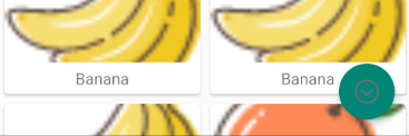
使用Glide加载图片
Glide.with(mContext).load(fruit.getImageId()).into(holder.fruitImage);
Glide.with()传入一个Context、Activity或Fragment参数
再调用load()方法去加载图片,最后再调用into()方法将图片设置到一个具体的ImageView中
使用GridLayoutManager布局方式
AppBarLayout
将Toolbar嵌套在AppBarLayout中可以有效解决toolbar被覆盖的问题
<com.google.android.material.appbar.AppBarLayout
    android:layout_width="match_parent"
    android:layout_height="wrap_content">

    <androidx.appcompat.widget.Toolbar
        android:id="@+id/toolbar"
        android:layout_width="match_parent"
        android:layout_height="?attr/actionBarSize"
        android:background="?attr/colorPrimary"
        android:theme="@style/ThemeOverlay.AppCompat.Dark.ActionBar"
        app:layout_scrollFlags="scroll|enterAlways|snap"
        app:popupTheme="@style/ThemeOverlay.AppCompat.Light" />
</com.google.android.material.appbar.AppBarLayout>
app:layout_scrollFlags用于调节Toolbar隐藏或显示属性
SwipeRefreshLayout
通过SwipeRefreshLayout实现下拉刷新
在RecyclerView外面嵌套一层SwipeRefreshLayout实现自动下拉刷新功能
<androidx.swiperefreshlayout.widget.SwipeRefreshLayout
    android:id="@+id/swipe_refresh"
    android:layout_width="match_parent"
    android:layout_height="match_parent"
    app:layout_behavior="@string/appbar_scrolling_view_behavior">

    <androidx.recyclerview.widget.RecyclerView
        android:id="@+id/recycler_view"
        android:layout_width="match_parent"
        android:layout_height="match_parent"
        app:layout_behavior="@string/appbar_scrolling_view_behavior" />
</androidx.swiperefreshlayout.widget.SwipeRefreshLayout>
在代码处添加具体的刷新逻辑
private SwipeRefreshLayout swipeRefresh;在onCreation()加入
swipeRefresh = findViewById(R.id.swipe_refresh);
swipeRefresh.setColorSchemeResources(R.color.design_default_color_on_primary);
swipeRefresh.setOnRefreshListener(new SwipeRefreshLayout.OnRefreshListener() {
    @Override
    public void onRefresh() {
        refreshFruits();
    }
});
其中onRefresh中添加具体刷新的操作
CollapsingToolbatLayout
这个空间只能作为AppBarLayout的直接自布局来使用,而AppBarLayout又必须是CoordinatorLayout的子布局
<com.google.android.material.appbar.CollapsingToolbarLayout
    android:id="@+id/collapsing_toolbar"
    android:layout_width="match_parent"
    android:layout_height="match_parent"
    android:theme="@style/ThemeOverlay.AppCompat.Dark.ActionBar"
    app:contentScrim="?attr/colorPrimary"
    app:layout_scrollFlags="scroll|exitUntilCollapsed"
    android:fitsSystemWindows="true">
    <ImageView
        android:id="@+id/fruit_image_view"
        android:layout_width="match_parent"
        android:layout_height="match_parent"
        android:scaleType="centerCrop"
        app:layout_collapseMode="parallax"
        android:fitsSystemWindows="true"/>

    <androidx.appcompat.widget.Toolbar
        android:id="@+id/toolbar"
        android:layout_width="match_parent"
        android:layout_height="?attr/actionBarSize"
        app:layout_collapseMode="pin"/>

</com.google.android.material.appbar.CollapsingToolbarLayout>
app:layout_collapseMode用于指定当前空间在CollapsingToolvarLayout折叠过程中的折叠模式,Toolbar指定成pin表示折叠时位置不变,ImageView指定成parallax,表示会在折叠过程中产生一定的错位偏移。
想要让背景图和系统状态栏融合,需要借助Android: fitsSystemWindows这个属性来实现。而且该部件的父布局都要设置